Social calendar redesign
As the company continues to evolve, we recognize the increasing demand for a streamlined social media management experience
I was tasked with revamping the social media management experience to improve usability, clarity, and efficiency. While the platform already allowed users to schedule, track, and manage posts across multiple locations, the experience needed a modernized design, better information hierarchy, and enhanced functionality.
This case study outlines the challenges, design decisions, and impact of this revamp.
Current challenges
The existing social calendar presents several issues that impair user experience:
Outdated Design: The layout, colors, and fonts do not align with contemporary design standards, leading to a dated appearance.
Poor Information Architecture: Users struggle to navigate due to a lack of clear structure and organization.
Inadequate Display of Information: Users cannot easily identify which posts have been published or scheduled; missing images and descriptions contribute to confusion.
Lack of Differentiation: There is no visual distinction between posted and scheduled posts, complicating management.
Missing Functionalities: Essential features such as drag-and-drop functionality, quote tweeting, and list views are absent.
Cluttered Calendar View: When multiple posts are scheduled for a single day, only a number is displayed (e.g., "+31 more"), making it difficult to access individual post details.
Hidden Action Items: Important actions like edit, delete, and copy are not easily accessible, requiring unnecessary clicks for navigation.

Old design
Goal
Our primary goal is to improve the overall user experience by modernizing the interface and making it more engaging. Also it not just by updating the UI but by fundamentally improving how users interact with their social app.
Information architecture
The first step was to peel back the layers of confusion. I began by rethinking the structure of the platform, diving into the very way information was organized. I asked myself: How can I make every piece of data—every scheduled post, every published update—immediately understandable?
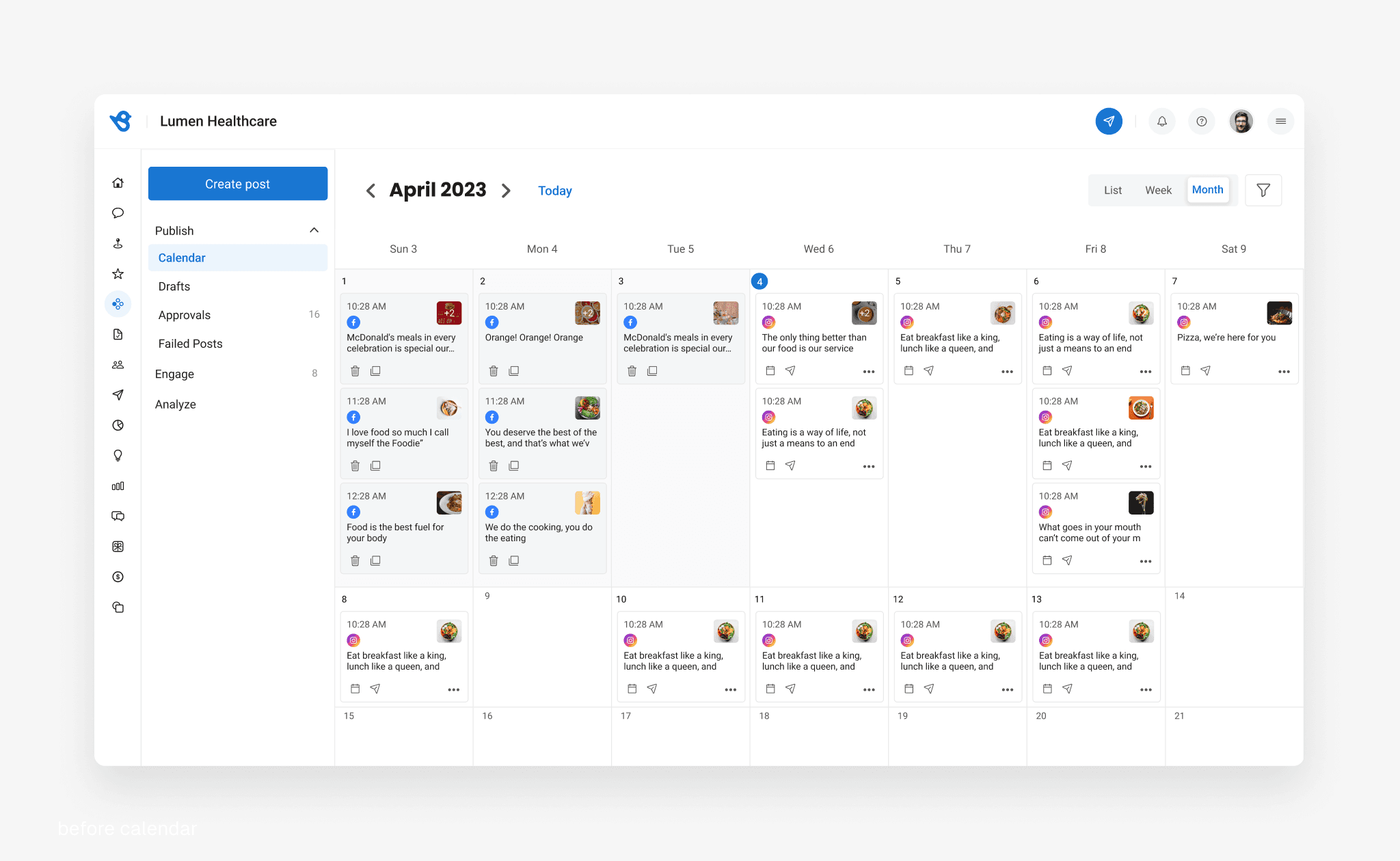
I redefined the system to clearly separate Scheduled Posts from Published Posts, ensuring users knew exactly where they were at any given moment.
I created flexible viewing options—Week, Month, and List Views—so users could choose the perspective that best suited their workflow.
I segregated two different bucket for action item for published post and scheduled post which help me to give more clarity
This new architecture wasn’t just a change in labels—it was a shift towards clarity and efficiency.

Crack the base component
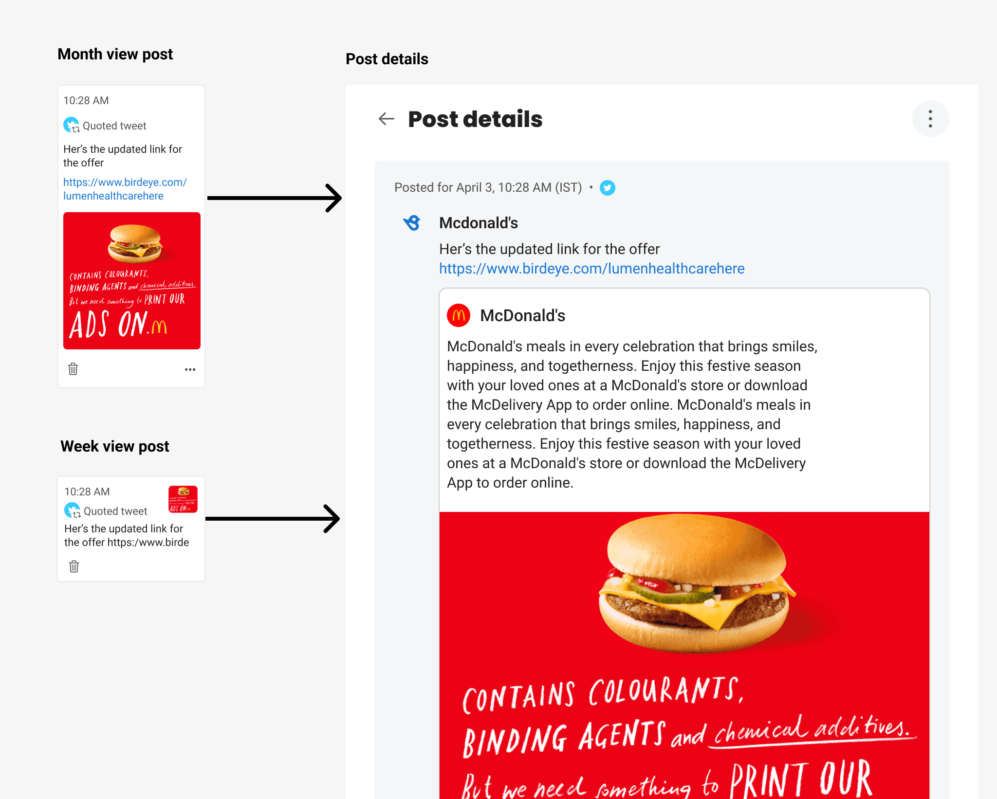
I started with base component first is that post card how it will look like in week and month view
I experimented with several iterations, including one featuring a modern left-side border with a larger image and a two-line text block, and another tailored for image-centric posts that showcased only the image with the icon subtly placed at the bottom. I also developed a simplified vertical card that integrated all necessary information without overcrowding the interface. Throughout this process, I addressed challenges like fitting all elements neatly in the week view—especially when multiple social media icons were involved.
Throughout these iterations, I faced challenges such as fitting all elements (text, image, icons, and actions) neatly in the week view, especially when a post contained multiple social media icons.

Post details page
When I first evaluated the old design, I noticed that while it served its functional purpose, it lacked a clear visual hierarchy and felt somewhat dated—there was little differentiation between content areas, making it harder for users to scan important details and poor IA. My goal was to create a more modern, intuitive layout that would guide the user’s eye to key information and improve overall engagement.
The first step was experimenting with a flat approach, removing unnecessary shadow, clear spacing. This simplified layout made the page feel more contemporary and easier to read, but I soon realized it needed stronger visual grouping for larger amounts of data. That insight led to the filled approach, where I introduced subtle background colors for each section, giving the design a card-like structure that highlighted important stats and activities and strong heading.
While this was a step forward, I still wanted to refine the overall look, so I moved to a modern style that combined the minimalism of flat design and also combine the post and post metrics into one card and very detailed metrics user don't want to go another tap now they will see all the metrics upfront. This final iteration balanced visual depth, clarity, and aesthetics, resulting in a clean, polished interface that guides users seamlessly through each section.

Added few more features
Beyond the core elements, I introduced additional features to further enhance usability:
One of the most requested features was the ability to Quote Tweet—an option available only for Twitter, The key challenges is to Integrating this feature into a small card in both week and month views was complex, especially when handling error states or dealing with the looping nature of Twitter threads. I had to ensure that the final quoted tweet was clear and concise, without overwhelming the user with too much information.
Drag & Drop : This intuitive feature allows users to reposition posts directly within the calendar, removing the need for multiple clicks.

Drag & Drop
List View: A new view was designed to display individual posts in a detailed card format, giving users an in-depth look at each entry—especially useful in month view when many posts are scheduled.
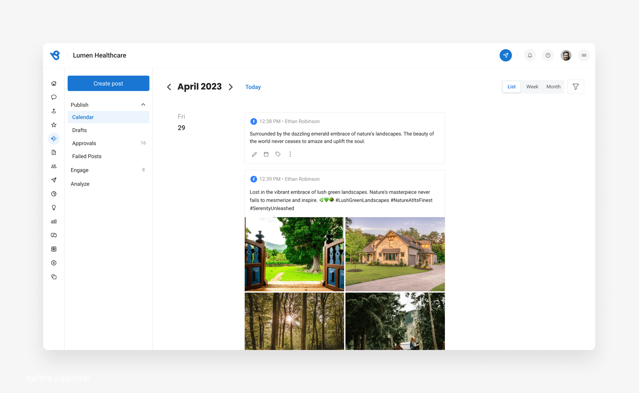
List view
Reflection
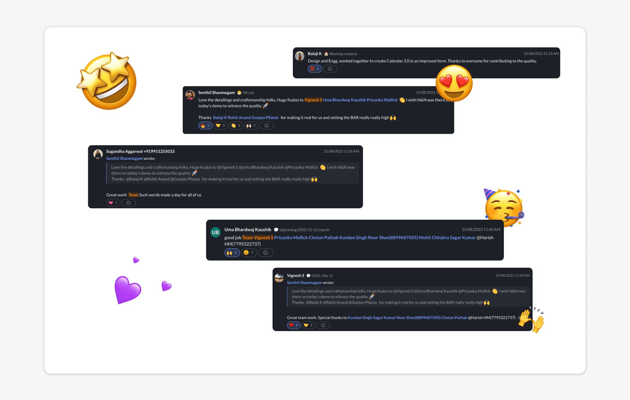
The beauty of a product lies in its details—those moments that might seem small but ultimately define the user's journey. I had the opportunity to work closely with Product Managers, Engineers, and QA teams on a focused to revamp our social calendar.
Through rigorous user testing and continuous feedback, we refined every element until our improvements shone through: users now navigate the platform more faster, interact more deeply with scheduled posts, and enjoy a streamlined experience when editing, deleting, or duplicating content. Early feedback on our new drag-and-drop functionality was overwhelmingly positive, reaffirming that thoughtful, user-centric design can truly transform a product.